Most company websites have proof. Logos, numbers, reviews, awards. The problem is where it sits. It lives on an About page, a references page or a block halfway down that most visitors scroll past. Then the buyer reaches the button with nothing in front of them but a claim. Our rule is simple. Put proof where the decision happens. Logos, numbers and reviews go next to the button, not on a page nobody visits. Here is what that looks like on three live sites we built in Webflow.
Proof only counts where the buyer decides
A visitor does not decide once. They decide in small steps. Keep reading? Click? Fill in the form? Every button is a moment of doubt.
Proof answers one question: is this true? It does its best work in the same view as the button, at the exact moment the visitor is asked to act. Three scrolls away, it answers a question nobody is asking yet.
So the test is not whether you have proof. The test is what the visitor sees next to each button.
Three places a decision happens
Most pages have three decision points:
- The first button. The visitor has read one headline. They need a reason to believe it before they click.
- The end of the work. After a case study or a project list. The visitor has just seen what you can do, and the next step should be one click away.
- The form. The last step. The doubt here is about risk. Will anyone reply? What happens after I send this?
Each point needs its own proof, matched to the doubt in that moment.
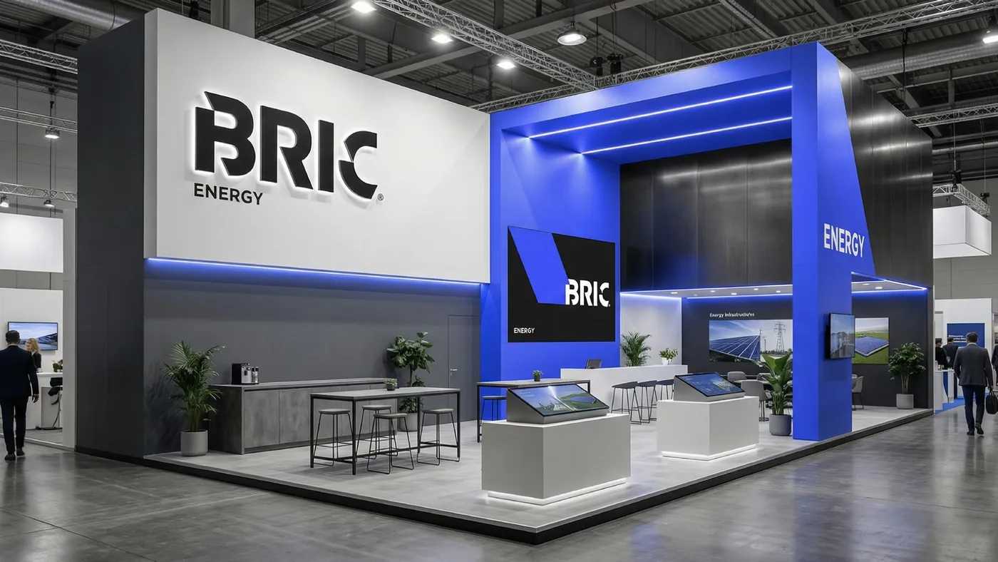
BRIC: four facts under the first button
BRIC plans and builds solar projects across Europe. On the site we built for BRIC, the hero reads “Wir bauen Solar. Sie ernten die Energie.” (We build solar. You harvest the energy.) Directly under the “Projekt Anfragen” (Request a project) button sits a strip of four facts:
- “1+ GW installierte Leistung” (1+ GW installed capacity)
- “100+ Projekte weltweit” (100+ projects worldwide)
- “Eigene Montageteams” (Our own installation teams)
- “Seit 2015” (Since 2015)
All four sit on the first screen. The claim and the proof arrive together.
Further down, the references block lists projects by name and size, such as “Sendai 51 MW” and “Yagoyama 27 MW”, plus “800+ MW” for Europe. The “Referenzen ansehen” (View references) button sits right under those figures.
After the comparison block, the “Jetzt Projekt starten” (Start your project now) button has one line directly under it: “Wir melden uns innerhalb von 24h” (We will get back to you within 24 hours). That is proof too. It is a promise about what happens after the click, placed exactly where the visitor worries about it.
Bárries: every result ends in a button
Bárries builds social media systems for brands that want to grow. On the site we built for Bárries, a scrolling bar at the top of the page carries “German Design Award 2026”, “150+ Projekte” (150+ projects) and “Google 5,0 ★★★★★” (Google 5.0, five stars). The hero holds two buttons, “Erstgespräch buchen” (Book an intro call) and “Referenzen ansehen” (View references). Right under the hero comes a logo row with the line “Vertraut von wachstumsorientierten Brands im DACH-Raum.” (Trusted by growth-focused brands in the DACH region.)
The case studies show the pattern most clearly. The Solenea Burgau block shows “408.075” (408,075) organic views, “+340%” organic reach and a “4,8%” (4.8%) engagement rate. The Primegate Consulting block shows “+ 356.82%” follower growth. Each block ends with its own “Erstgespräch buchen” button. The visitor reads a result, and the next step is right there.
The contact block does the same for the form. Three short cards, “Antwort innerhalb 24h” (Reply within 24h), “100% unverbindlich” (100% no obligation) and “Erste Preiseinschätzung” (First price estimate), sit above the form. A named review from Ralf Baur of Steuerkanzlei Baur sits right beside the fields.
Primegate: proof that matches the promise
Primegate recruits for hard-to-fill roles. On the site we built for Primegate, the hero headline promises speed: “Wenn Zeit Ihr Engpass ist, sind wir Ihr Vorteil.” (When time is your bottleneck, we are your advantage.) One of the lines under it reads “Kandidatenpipeline das ganze Jahr.” (A candidate pipeline all year round.)
The proof right below the hero buttons backs that exact claim. A row of cards shows “250+ Active Candidates”, with candidate profiles that give a first name, an initial, a role and years of experience, such as “12 Jahre Erfahrung” (12 years of experience). The next button, “Rolle klären” (Clarify the role), follows shortly after.
Further down, the page explains where the speed comes from, under the heading “Wir sind schnell, weil wir vorbereitet sind.” (We are fast because we are prepared.) Three reasons follow: specialisation, process and pipeline. A “Personalbedarf besprechen” (Discuss your hiring needs) button comes soon after.
The lesson is that proof should answer the promise you make. If you sell speed, show what makes the speed possible.
How to place your own proof
- List every button on the page. Hero, mid-page, after the work, at the form, in the footer.
- Write down the doubt at each one. Is this real? Can they do it for me? What happens if I send this?
- Pick the proof that answers that doubt. Hard numbers and logos at the first button. Named results and projects after the work. Reply time, no-obligation terms and a named review at the form.
- Put it in the same view as the button. If the visitor has to scroll to see both, they are not together.
- Repeat your best number at the last button. The final call to action is your last chance to remove doubt.
We follow the same rule. On our services page, the line “400+ jobs completed · 230+ five-star reviews” sits directly above the Book a call button, not on an About page.
Audit the buttons, not the proof
Most sites do not need more proof. They need the proof they have moved. Start with your buttons, check what sits next to each one, and close the gap.
If you want a site built around that rule, book a call.