Most websites do not fail because of the design. They fail because nobody decided who the site is for. The team picks colours, debates fonts and argues about animations, and the buyer never gets named. So the headline talks to everyone, and everyone scrolls past. Our rule is simple. If we can’t name your buyer, we don’t design yet.
Why “everyone” is the wrong buyer
A site written for everyone has to stay vague. It says “solutions for businesses of all sizes” because it cannot risk leaving anyone out. Vague copy feels safe to the team that writes it. To the buyer, it reads like it was written for someone else.
Your buyer lands with one question. Is this for me? They answer it in seconds, from the headline and the first thing they see. If the answer is not an obvious yes, they leave. They do not scroll to find out.
Naming one buyer feels like shrinking your market. It does the opposite. The right person reads the page and thinks “finally, someone gets it.” That is the moment a visit turns into a lead.
Three questions that name your buyer
Before we sketch a single section, we answer three questions with the client:
- Who buys? Not “SMBs” or “decision makers”. A role, a company type and a situation. For example, a head of finance at a growing SaaS company who still closes the books in spreadsheets.
- What do they already believe? About the problem, about vendors like you and about the cost of getting it wrong. You do not have to teach these beliefs. You have to meet them.
- What makes them say yes? The proof, the promise or the low-risk next step that moves them from interested to in touch.
Write the answers down in one paragraph. That paragraph becomes the brief for every headline and every section. When a review stalls on “do we need this block?”, the paragraph decides.
One headline, one reader
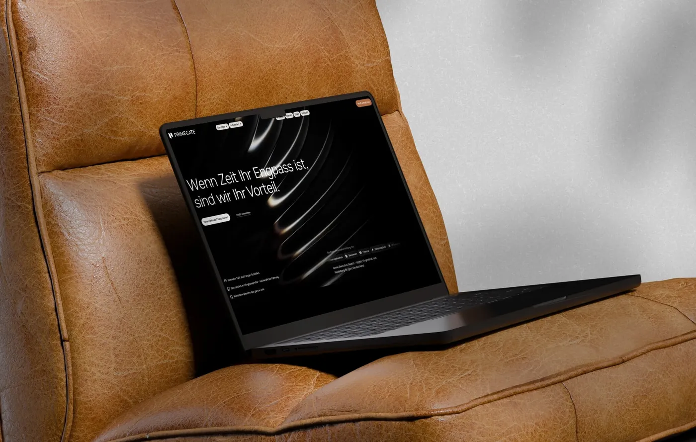
Look at the site we built for Primegate, a firm that recruits for hard-to-fill roles in tech, construction and finance. The hero reads “Wenn Zeit Ihr Engpass ist, sind wir Ihr Vorteil.” (When time is your bottleneck, we are your advantage.)
That line does not describe recruiting. It describes the reader’s problem. The person it speaks to has a key role open and is losing time every week it stays open. Right below it, the page lists the fields it covers: automation, construction, finance, electrical engineering and IT. A hiring manager in one of those fields sees their world named within seconds.
The main button says “Personalbedarf besprechen” (Discuss your hiring needs). It sits in the hero and comes back after the major sections. Candidates are a second audience, and they get their own door, a separate “Profil einreichen” (Submit your profile) button. In the hero, the employer button comes first. Two audiences, two clear actions, and the paying buyer leads.
Say what you make, in the buyer’s words
Heigl Blaubeuren, a site we built in Webflow, belongs to a company that makes machine frames and metal housings for industry. Its hero says “Metallbau für die Industrie” (Metalwork for industry). The line under it names the products in the terms an industrial buyer already uses: machine frames, machine stands, machine enclosures and metal housings, made as a contract manufacturer for industry and mechanical engineering.
Think about who buys here. A purchaser or engineer at a machine builder. They already believe most suppliers overpromise on quality and delivery. So the page does not argue. It lists facts. Production floor space, its own vehicle fleet, years in the market and ISO certifications sit right under the hero. Each service then carries a short list of hard capability facts, such as machines, working sizes and welding methods.
There is also a customer award, with the customer’s own laudation printed in full. That is proof written by the kind of company the page sells to. The call to action stays the same everywhere: “Jetzt anfragen” (Request now). An industrial buyer does not want a clever button. They want to ask for a quote.
Write for the belief they already hold
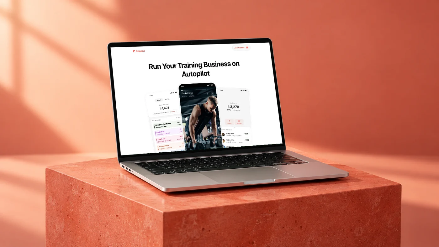
Regent is client management software for personal trainers, and we designed and built its site. The hero says “Run Your Training Business on Autopilot”. It speaks to a trainer who is good at training and tired of the admin around it.
The sections read like a trainer’s list of headaches: scheduling, payments, onboarding, online training, and protection from cancellations and no-shows. Most trainers know what a late cancellation costs. The page does not explain why that hurts. It names the pain and shows the fix.
The testimonials come from personal trainers, and most of them talk about one thing. No more awkward payment conversations with clients. That is the belief the buyer walks in with. Chasing money damages the relationship. The page meets that belief instead of fighting it. And there is one action, repeated twice: join the waitlist.
What converts and what does not
In 400+ jobs, we keep seeing the same pattern. The pages that convert do a few things well:
- The headline names the buyer’s problem or outcome, not your category.
- The proof is the kind that buyer trusts. Facts for engineers, peers for trainers, speed for hiring managers.
- There is one main action, and it shows up wherever the buyer is ready.
- A second audience gets its own door, not half of the home page.
The pages that do not convert share the opposite habits:
- A headline that could sit on any competitor’s site.
- Feature lists with no reader in mind.
- Five buttons with equal weight, so none of them wins.
- Proof aimed at the wrong person, like investor logos on a page written for buyers.
This is why we pin down your ICP before any design starts. We write the buyer in one paragraph, check it with you, then test every headline and section against it. If a section does not help that person say yes, it goes.
Name the buyer, then design
Design makes a clear message look good. It cannot make an unclear message clear. So start with the person. Who buys, what they already believe and what makes them say yes. Get those three right and the headline almost writes itself.
If you want a site built around the buyer you actually sell to, book a call.