Premium buyers do not want to be sold to. They want to be sure. Most premium websites get this backwards. They pile on words like luxury, exclusive and world-class, then wonder why the right people never call. The harder a page insists it is premium, the less premium it feels. The fix is easy to say and hard to do. Say less. Prove more.
Know what the premium buyer already believes
Start with the buyer, like always. A premium buyer has bought at this level before. They assume the product is good. Quality is the entry ticket, not the reason to choose you.
What they doubt is different. Are you the real thing, or a reseller with nice photos? Will you respect their time and their privacy? Will you push them into a deal that suits you more than them?
That changes the job of the page. You do not need to convince them that quality matters. You need to remove the doubt, quietly, and make the next step feel safe.
Say less: one idea in the headline
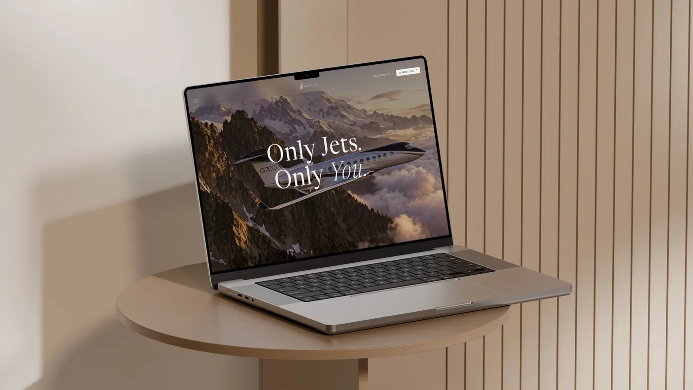
OnlyJets, a site we built in Webflow, works in private aviation: charter, aircraft sales and consulting. The hero says “Get the right advice.” Four words. The line under it does the rest. It says the team flies aircraft, buys them and will sometimes talk you out of the wrong one.
That line is aimed at one belief. A buyer in this market has met brokers who get paid when the deal closes, so they expect to be pushed. The page answers that doubt before the buyer can raise it. The rest of the home page stays light. Three services, one short promise for each, and a closing invitation to talk to someone with no agenda.
The consulting page goes further. Its first problem block is called “The Trust Gap”, and it spells out the conflict buyers worry about: brokers and manufacturers earn when you transact. The page names the buyer’s fear in plain words, then sets the service against it. No adjectives needed.
Prove more: put proof where the doubt is
Proof on a premium site is not a wall of badges. It is the answer to a specific doubt, placed where that doubt comes up.
On the OnlyJets about page, the track record sits in large numerals: years in aviation, aircraft deals and countries served. The aircraft sales page lays out the process in six steps, from mandate and valuation to inspection, negotiation and closing. A buyer worried about surprises can see exactly where each one gets checked.
Vikar Ahmed, a high jewelry house in Idar-Oberstein and another site we built in Webflow, handles proof differently. The bespoke page walks through how a piece is made. Sketches and watercolours come first, then CAD visualisation, then the goldsmiths’ work of setting the stones and polishing by hand. A separate “Seen On” page names public figures who have worn the pieces on red carpets and stages, and mentions TV productions.
Neither site shouts. The proof is there for the buyer who goes looking, and a premium buyer usually does.
Let the craft carry the message
The Vikar Ahmed home page opens with “Made in House” and “Germany”. No pitch. No adjectives. Origin first. For a buyer of high jewelry, where and how a piece is made is the claim. Everything else follows from it.
The copy stays short. Most blocks run one to three sentences, and the images carry most of the weight. The page talks about the goldsmithing tradition of Idar-Oberstein and the rare Paraíba tourmaline, and then it gets out of the way.
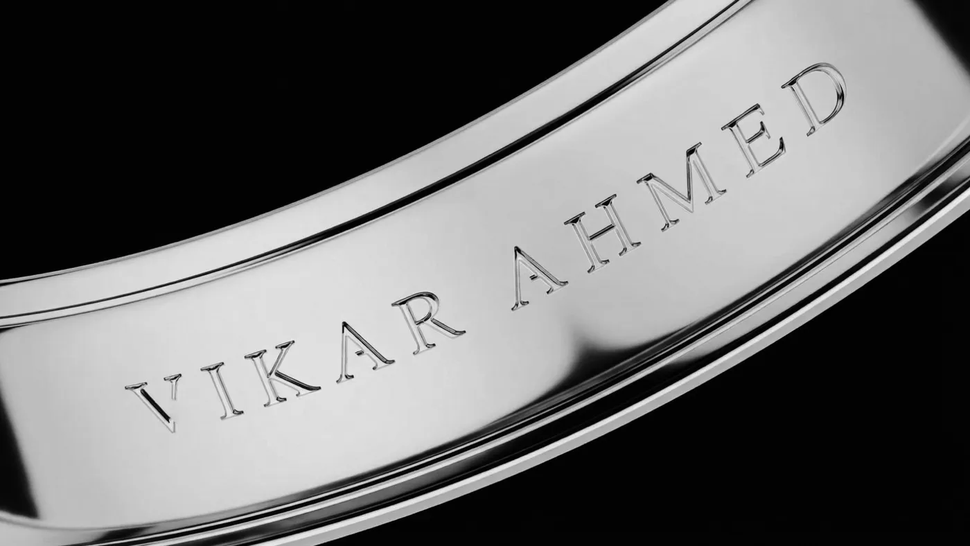
Short copy is not lazy copy. Every line has to earn its place, because there are so few of them. A premium page with five strong sentences beats one with fifty average ones.
What premium buyers say yes to
Look at the main buttons on both sites. Vikar Ahmed’s header offers “Private Beratung” (Private consultation), and the home page closes with “Kontakt aufnehmen” (Get in touch). OnlyJets uses “Contact Us” in the hero and “Speak With Our Team” at the end.
None of them says buy now. For a high-value, considered purchase, the yes is not a checkout. It is a conversation. The buyer wants to talk to a person, ask hard questions and decide in private. The whole job of a premium site is to earn that conversation.
So the call to action should feel like an invitation, not a trap. One clear next step. No countdown timers. No pop-ups asking for an email before the buyer has seen the work.
What kills a premium position
We see the same mistakes across categories:
- Adjectives instead of evidence. Luxury, exclusive and world-class mean nothing on their own.
- Too many messages in the hero. One idea lands. Three ideas blur.
- Badges stacked like a discount store. Proof should feel earned, not piled up.
- Discount language and urgency tricks. They signal that the brand needs the sale.
- Pages that explain everything. A premium buyer reads confidence in what you leave out.
Say less, prove more
Name the buyer first. Write down what they already believe and what they doubt. Then cut the headline to the one idea they care about, and put proof exactly where the doubt sits. Everything else is decoration.
If you want a premium site built around the buyer you actually serve, book a call.