

Homepages grow by addition. A new service gets a section. A partner gets a logo. A launch gets a banner. Nobody removes anything, so a year or two later the page asks for ten things and the main ask gets lost. Our principle cuts the other way. One page. One job. The homepage gets one action, and anything that doesn’t move people toward it goes. Here is the audit we run, with a checklist at the end you can run on your own homepage today.
Start with the job
Before you look at a single section, write down the homepage’s one action. Book a demo. Start a trial. Book a call. Request a quote.
If your team can’t agree on one, stop here. That disagreement is the real problem, and no layout will fix it. Every decision in the rest of the audit depends on this answer, because “does this convert?” only means something once you know what it should convert into.
The first-screen test
Open your homepage on a laptop and on a phone. Don’t scroll. In that first screen, a stranger should find three things:
- What you do.
- Who it is for.
- What to do next.
The site we built for Seconds shows how much a few lines can carry. The headline reads “Creating Pivotal Seconds That Move Organisations”, and the line below it calls the company “an innovation consultancy for European category leaders”. What it is and who it serves are both answered before the visitor scrolls.
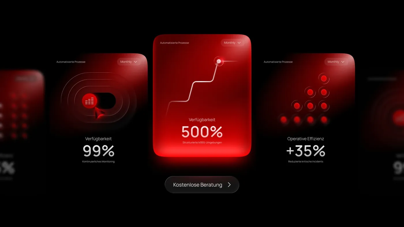
The site we built for ScaleITs, which offers IT services, security and managed solutions, covers the third point. The headline reads “Ihre IT-Transformation beginnt hier” [Your IT transformation starts here]. The first screen has three buttons. Two of them, “Kostenlose Beratung” [Free consultation] in the header and “Kostenlose Beratung anfragen” [Request a free consultation] in the hero, go to the same contact page. The third, “Unsere Services entdecken” [Discover our services], leads to the services page. One action, shown twice, plus one way to learn more.
Count every action
Now scroll the whole page and list every button and link outside the main navigation. Next to each one, write where it goes. Then sort them into three groups:
- The main action. Every button that leads to your one action. Repeats are good. On the ScaleITs homepage, “Kostenlose Beratung anfragen” appears again after the section on why to choose them, with the same words and the same destination as the hero button.
- Support links. Links that answer a question a buyer has before acting, like case studies or pricing.
- Everything else. Links that send people somewhere with no clear path back to the action.
The third group is your cut list. The first group should be the loudest thing on the page.
Cut, merge or move
Go section by section and ask one question: does this help a visitor take the action? Then decide.
- Cut sections that say nothing specific. If the copy could sit on a competitor’s homepage unchanged, it isn’t doing any work.
- Merge sections that make the same point twice. Two blocks of benefits become one.
- Move detail that some buyers need and most don’t. Give it its own page and leave a link.
Nothing useful is lost. The homepage just stops carrying weight it doesn’t need.
Make the action easy to take
A clear button is only half the job. What happens after the click matters as much.
Cut form fields you don’t need for the first conversation. Name the button after what the visitor gets, never “Submit”. Put proof close to the ask, so the doubt and the answer sit side by side.
The Seconds homepage offers a direct route to people. Near the end of the page, after a section headed “Let’s talk”, named team members each get two buttons: “Send Email” and “Book Appointment”. A buyer who is ready can pick a person and book a time straight away.
The homepage audit checklist
Run this on your own homepage. Answer each question with yes or no.
- Can you write the homepage’s one action in a single sentence?
- Does the headline say what you do in plain words?
- Does the first screen say who it is for?
- Is there one main action in the first screen, even if it appears more than once?
- Do all main buttons go to the same place, with wording that clearly means the same thing?
- Does the button label name what the visitor gets?
- Does the main action appear again further down and at the end?
- Does every section answer a question a buyer has before acting?
- Is proof, like logos, reviews or results, placed near the ask?
- Does the form ask only for what you need for the first conversation?
- Is there an obvious route to a person for buyers who are ready now?
- Does the page pass all of this on a phone, not just a laptop?
Every “no” is a fix. Start with the first screen, because it is the one part every visitor sees.
Run it, then cut
Most homepages don’t need more. They need less, aimed at one thing. Run the checklist, make the cuts and check the page again on a phone.
If you want us to run this audit with you and turn the answers into a page that works, book a call.