
Most pages ask for too much. Book a demo. Start a trial. Watch the video. Read the blog. Follow us. Download the guide. Each ask looks harmless on its own. Together they hand the visitor a decision, and a visitor who has to decide often does nothing. Our rule is simple. One page. One job. Each page gets one action: a demo, a trial or a call. Anything that doesn’t move people toward it gets cut. Here is how to pick that action, with three live sites as examples.
Why one action wins
A page is a sales conversation with no salesperson in the room. A good salesperson does not end a meeting with five options. They ask for one next step.
Every extra button splits attention. It also hides your real goal. If “Read our blog” looks as important as “Book a demo”, the visitor has no way to know which one you want. So they guess, or they leave.
One action fixes both problems. The visitor always knows what to do next, and you always know what to measure.
Pick the action a real buyer takes next
The right action is not the one you want most. It is the next step a serious buyer is ready to take after reading the page.
- Trial. Fits a product people can set up alone and get value from fast.
- Demo. Fits a product that needs explaining, or a sale with more than one decision maker.
- Call or quote. Fits a service, where the buyer wants to talk to a person first.
- Waitlist. Fits a product that is not open yet.
If you are torn between two, pick the smaller step. Saying yes to a short form is easier than saying yes to a long call.
Regent: one action, nothing else
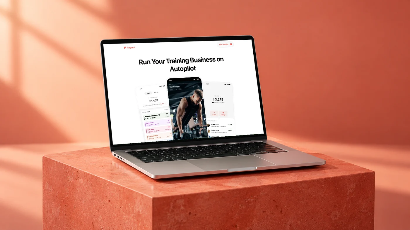
Regent is client management software for personal trainers. We designed and built the site in Webflow. Its hero headline reads “Run Your Training Business on Autopilot”. The first screen holds the logo, the headline, the product shots and one button: “Join Waitlist”.
That button jumps to a waitlist form. The form asks for one thing, an email address, and its button says “Join Now”. The same form appears twice, straight after the hero and again at the end, after the FAQ. Everything in between explains the product, feature by feature, so a trainer who reads it all lands back at the same form.
There is no second offer fighting for the click. No demo, no newsletter, no pricing link in the first screen. A visitor can do one thing, and it is the thing the page exists for.
Diamond Air & Energy: one outcome, two routes
Diamond Air & Energy does air conditioning, electrical and solar work in Brisbane. The site we built for them opens with the headline “Perfect Air. Reliable Energy.”
The first screen shows three buttons: a phone number and “Get a Quote” in the header, and “Contact Our Team” in the hero. That looks like three actions. It is one. “Get a Quote” and “Contact Our Team” both go to the contact page, and the phone number reaches the same team for people who would rather call.
This is the part worth copying. One action can have more than one door, as long as every door opens into the same room. Further down, a quote button shows up again in the “Why Choose Diamond Air & Energy?” section and in the “Free consultation with us” section. Both jump to the contact form at the bottom of the same page.
Atoria Immobilien: make the first step tiny
Atoria Immobilien is an estate agent for Rhein-Main and Bad Nauheim. The site we built for them leads with “Strategie statt Zufall. Immobilien richtig verkaufen.” [Strategy instead of chance. Selling property the right way.]
Beside the headline sits one line, “Jetzt kostenfreie Immobilienbewertung starten” [Start your free property valuation now], one address field and one button, “Bewertung anfordern” [Request valuation]. The header has no competing button, only navigation links.
The action is one field long. A homeowner types an address and presses the button. That is about as small as a first step gets, and a small step is an easy yes.
How to pick yours in five steps
- Write the page’s job in one sentence. “This page gets qualified founders to book a demo.” If you can’t write it, the page is not ready.
- Choose one action. Demo, trial, call, quote or waitlist. One.
- Name the button after the outcome. “Book a demo” beats “Submit”. “Request valuation” beats “Learn more”.
- Repeat it, don’t vary it. Wording that means the same thing and one destination, in the header, the hero and the close.
- Demote everything else. Secondary links become text links or move to the footer. If a section doesn’t help the visitor take the action, cut it.
Then look at your first screen and count the buttons. If they lead to more than one place, the page has more than one job.
Start with one page
You don’t need to rebuild the whole site to apply this. Take your most visited page, give it one job and cut whatever competes with it. Then move to the next page.
If you want a second pair of eyes on which action each page should ask for, book a call.