Most homepages lose the visitor before anyone reads the body copy. A visitor lands, scans the top of the page and decides in a few seconds whether to stay. If they cannot tell what you sell and who it is for, they leave. Nothing below the fold gets a chance. That is why we get the headline and the offer right before we style anything. Here is the test we use, and three live sites we built that show how it plays out.
What the five-second test checks
Open your homepage. Look at it for five seconds. Close it. Now answer two questions.
- What does this company sell?
- Who is it for?
If you cannot answer both in plain words, your visitors cannot either. And they will not try as hard as you just did. They have other tabs open.
The test is not about clever copy. It is about clear copy. A visitor who understands the offer can decide if it fits them. A visitor who has to guess usually decides it does not.
The one-sentence formula
A clear offer fits in one sentence with three parts.
- What you sell. The category, in words your buyer already uses.
- Who it is for. A group specific enough that the right people feel seen.
- What they get. The result, not the feature list.
Here is a generic example. It is not from any client.
Before: “The future of work, reimagined.”
After: “Scheduling software for dental clinics that fills empty chairs.”
The first line could sit on a thousand sites. The second tells a clinic owner in two seconds what it is, that it is for them and why they should care. It is less fun to write. It is much easier to buy from.
TextRocket: the offer in three short claims
TextRocket, a site we built in Webflow, sells a tool for premium SEO content, publish-ready and at scale. The live page is in German. The hero headline reads “Premium SEO Texte. Publish-ready. Skalierbar.” [Premium SEO texts. Publish-ready. Scalable.]
Three short claims, and each one does a job. The first names what you get. The second answers the biggest worry a content team has, which is how much editing the text will need. The third says it works at volume. A small line above the headline calls it a premium SEO content tool, so the category is clear too.
The line under the headline promises high-quality SEO texts in series, without briefing chaos, quality loss or runaway costs. That speaks straight to people who run content for a living, and the rest of the page says it is built by SEOs for SEOs. The button says “Jetzt kostenlos testen” [Try it free now]. One clear action in the hero.
iMapper: product, category and result in one line
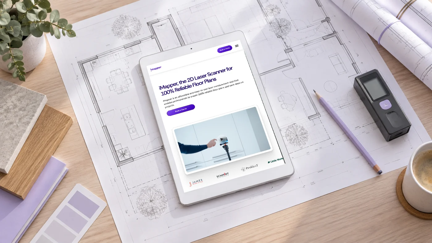
iMapper, a site we built in Webflow, sells a laser scanner that produces floor plans in minutes. Its hero headline reads “iMapper, the 2D Laser Scanner for 100% Reliable Floor Plans.”
That one line holds the product name, the category and the result. You know what it is, what it measures and what it promises.
The line under it adds who it is for and why it matters. It calls iMapper an affordable, easy-to-use measuring tool that helps professionals create reliable floor plans and save days on projects. The button says “Book a Demo”, which fits a device people want to see working before they buy.
Further down, the page names the groups it serves: interior designers, architectural firms, kitchen designers, project managers and real estate agents. The hero speaks to all of them at once by naming the job they share, which is measuring a space and drawing it.
PeakBid: the outcome on top, the channels right next to it
PeakBid, a site we built in Framer, sells Meta, Google and Microsoft ads for growing brands. Its headline takes a different route: “Mehr Umsatz. Weniger Streuverlust.” [More revenue. Less wasted ad spend.]
That headline is pure outcome. It speaks to anyone already paying for ads and watching part of that budget go nowhere. On its own, it does not say what PeakBid sells. The lines around it do. A small label above the headline names performance marketing, with Meta, Google and Microsoft beside it. The supporting line underneath talks about ad budget on those three platforms, run on data and focused on measurable results.
So the full offer is on the first screen: paid ads on three platforms, for brands that want more revenue and less waste. The main button says “Strategie-Call buchen” [Book a strategy call], with a second button to view the services.
This is the pattern to copy if your headline leads with a result. The result can own the big line, as long as the category and the audience sit right next to it. Visitors read the top of a page as one block, not one line at a time.
How to write yours before anything gets styled
Here is the order we follow when we work on an offer.
- Write the plain sentence first. “We sell [what] to [who] so they get [result].” No adjectives. No brand voice yet.
- Use your buyer’s words. If your buyers search for “payroll software”, do not call it a “people operations cloud”.
- Cut it into a headline. Pick the part your buyer cares about most, usually what you sell or the result. Move the rest to the line above or below it.
- Match the button to the offer. A demo for a product people need to see. A free trial for a tool people want to try. A call for a service people want to talk through.
- Test it on a stranger. Show the page for five seconds to someone who has never seen it. Not your cofounder. Not your designer.
Only then do we pick type, colour and layout. Good design makes a clear offer land harder. It cannot rescue a vague one.
Get the sentence right first
Your homepage gets five seconds. Spend them on what you sell and who it is for. Layouts and motion come after that, never instead of it.
If you want a second pair of eyes on your offer before your next site goes into design, book a call.