

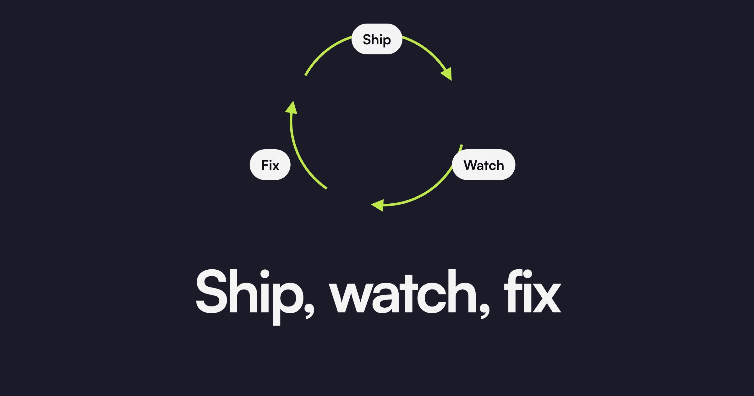
Most teams treat launch day as the finish line. The site goes live, everyone celebrates, and nobody touches it again until the next redesign. That is backwards. Launch is the first day you get real data from real visitors. Before launch, every choice on the page is a guess. After launch, you can see which guesses were right. Our principle is simple: ship, watch, fix. Here is what to watch in the first weeks, how to decide what to fix first, and why small weekly changes beat a big redesign.
Launch is the start
Before a site goes live, you design for the visitor you imagine. After it goes live, you meet the visitor you actually have. They read less than you hoped. They click things you did not expect. They ask questions the page never answers.
None of that means the site failed. It means you now know what to fix.
That is why every site we build is editable by your team from day one. Copy, images, CMS entries and simple sections should never wait on a developer.
What to watch in the first weeks
You do not need a dashboard with fifty charts. You need answers to five questions.
Where do visitors drop? Look at which pages people leave from, and how far they scroll on your key pages. If most visitors never reach the section that explains your offer, the problem sits above it.
Which call to action gets clicks? Track every main button as an event. If the same button appears in the hero and further down, see which one people use. If neither gets clicks, look at the offer and the wording before you blame the colour.
What are people searching for? Google Search Console shows the queries that bring people to your site. It often reveals words your customers use that your copy does not.
Which forms get finished? Compare how many people start a form with how many submit it. Too many fields, a confusing question or no clear reason to fill it in all show up here.
What does sales keep hearing? Ask your sales team, or whoever answers the inbox, which questions come up again and again. Every repeated question is a gap on the site. Answer it on the page and fewer leads stall.
Give every page one job
Regent is client management software for personal trainers, and we designed and built its site in Webflow. The home page has one job: get trainers onto the waitlist. The headline reads “Run Your Training Business on Autopilot”. The top bar has a “Join Waitlist” button, and an email form with a “Join Now” button sits near the top of the page, with the same form again at the bottom.
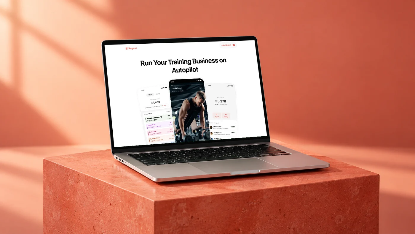
A page like this is easy to watch, because one number matters. After launch, the useful questions are plain. How many visitors join from the top form, and how many scroll all the way to the bottom one? Which feature sections, from smart scheduling to no-show protection, do people stop on before they sign up? How many press “Load more” on the testimonials? Each answer points to one change worth testing.
The lesson applies to any site. Give each page one main job. Then you know exactly what to measure.
How to decide what to fix first
You will find more problems than you have time to fix. Rank them.
- Broken things. A form that fails, a link that goes nowhere, a section that breaks on mobile. Fix these the same day.
- Problems closest to the money. Fix the step right before a sign-up, a purchase or a booked call before you touch the blog. A clearer pricing page is worth more than a prettier archive.
- Problems many people hit. A confusing hero affects every visitor. An awkward sentence on a deep page affects a few.
- Cheap fixes before expensive ones. A sharper headline takes an hour. A new page takes days. If two fixes look equally useful, ship the cheap one first.
Write the list down, put the most important item on top, and work down it one item at a time.
Small weekly changes beat big redesigns
A redesign changes everything at once. If sign-ups go up, you do not know why. If they go down, you do not know what to undo. You also throw away the parts that were working.
Small changes work the other way. Change one thing. Watch it long enough to see a pattern. Keep it if it helps, roll it back if it does not, then move to the next item. Each change teaches you something, and the lessons stack.
A simple weekly rhythm:
- Look at last week’s numbers and the questions sales heard.
- Pick one change from the top of your list.
- Ship it early in the week.
- Note the date, so you can compare before and after.
Over a few months, those small changes add up, and every one of them has earned its place.
Where our monthly plan fits
Some teams run this loop on their own. Your team can edit the site from day one, so nothing stops you.
Others want a partner. On our monthly plan, you send requests on Slack or email, and we work through them one at a time in the order you set. Most requests are done in 2 to 3 business days. Larger pieces are split into smaller steps, which suits the one change at a time approach. Every month we review what moved and fix what is not converting.
The plan also covers new pages, landing pages and sections in Webflow or Framer, updates to copy, CMS and components, and SEO and AI search upkeep. You can pause or cancel before the next billing date. There is no long-term contract.
Start watching this week
Pick your most important page. Write down its one job. Check where visitors drop, which button gets clicks and which questions sales keeps hearing. Fix the top item, then watch again.
If you want help deciding what to change after your launch, book a call and we will go through it with you.